 Here is a diagram from Scott McCloud's paramount, required reading, "Understanding Comic Books. The bottom right hand corner is a smiley face, the bottom left hand corner is reality, and the top is abstraction. This represents the three types of art. He puts the faces of various cartoons and manga ... ask yourself, where does your drawing style land in the pyramid?

Thursday, September 29, 2011
Scott McCloud Pyramid of style in comics
Here is a diagram from Scott McCloud's paramount, required reading, "Understanding Comic Books. The bottom right hand corner is a smiley face, the bottom left hand corner is reality, and the top is abstraction. This represents the three types of art. He puts the faces of various cartoons and manga ... ask yourself, where does your drawing style land in the pyramid?
Wednesday, September 28, 2011
Student Work - Introduction to Abstraction
 Pai Ka's scarecrow is interesting. She uses a good balance of iconic drawing and realistic drawing. While Scarecrow doesn't have legs, the figure is drawn in proportion. Scarecrow has an iconic mouth that feels gentle. An interesting character.
 Here is Joshua's character, Bulltron Mega. Joshua's drawings tend towards the iconic side; with this assignment I asked for proportionate realistic drawing, however, Joshua goes so over the top with detail and icons I actually really like this. Bulltron Mega has muscles, claw shoes, three eye balls, ear rings and what looks like a tonsil or a little man coming out of his mouth. This is an energetic, inventive drawing. It grabs your attention.
 Here is an anthology of Damion creating an index of expressive anatomy. Notice how later on he draws a character and uses creative anatomy to express a sense of concentration. Also notice how Damion uses a GREY SCALE. This is something we'll get into later.
 I was very happy with Marco's designed character for it's creativity and observation to detail. Marcos also didn't just draw Abe Lopez in a boring stance. Abe Lopez has taken a stance of exuberance with a facial expression of integrity and rage. Notice how Abe Lopez the space rapper is not standing still - his body is in motion as he raps through space.
 I am impressed by David's willingness, his figure's expression and the clarity of his character. Notice when David erases and remember that the eraser is just as important as the pencil itself. To create is fantastic; but to edit is sublime.
 Annie's character is a triumph. She understood the assignment inside and out and even went further by adding iconic hearts around Zory. The figure is in motion. The figure's posture emphasizes Zory's personality. Even Zory's clothing says something about who she is. I have a very good sense of this character and thus the assignment is well done.
 Here are some facial expressions from Mei Xian. Observe that not only is she making iconic faces, but also the differences in the character's hair. It is important to differentiate characters. Some of you seem to draw the same people over and over again. These characters are all different.
INTRODUCTION TO ABSTRACTION
Let's take a closer look at the difference between Pai Ka's Scarecrow and Joshua's Bulltron Mega. This time, attempt to look at the drawings not iconically or realistically. Pretend that the drawings represent absolutely nothing. If there is no character, no words, no icons ... what is there left to look at?
Presenting the American artist: Jackson Pollock. Pollock focuses on style over content. In the above painting, there is no content whatsoever. Simply energetic, splatter lines. On the one hand, one could argue this is simply a mess with no purpose, but on the other hand, one can imagine the artist going through the process of making this painting. It looks like fun to make, right? Well - I think it does.
Now - notice how GENTLE Pai Ka's line is. And how heavy handed Joshua's depiction of Bulltron Mega is. The WAY in which you draw says something about the character itself. When the line itself has a feeling, or protrays a feeling, it begins to fall into the field of abstraction.
Abstract art is the third type of art we are studying.
Abstraction is used in anime usually to portray emotion, motion or beauty.
For example:

Observe the above Dragonball Z picture. There are abstract lines behind the figures. Let's see what occurs when we remove the abstract lines.
 How does the SAME drawing look with the abstract lines in the background?
Often in Anime, abstraction is used to portray MOTION. This is referred to as "FUTURISM" and first came into existence in the early 1900s in Europe. We'll go over this more later. Once again, imagine the above picture without the abstraction. Would this be an exciting drawing that was fun to look at?
 Here is another example... what is going on in the background from the video still? I know this will be a black and white handout, but really ... what is all that?
In class today, try to protray an emotion WITHOUT ICONS OR FIGURES.
The emotions you can choose from are:
TRANQUILITY - which means - calmness; peacefulness; quiet; serenity.
ENTHUSIASM
ANGER
JOY
PLEASE USE COLOR.
Once your abstract drawing is done, draw a character that ALSO is expressing this emotion. We will then put the two drawings together by using scissors and glue in the next class!
 Here is an EXAMPLE. See how more intense BULLTRON MEGA looks when abstract lines are put behind him!
Sunday, September 25, 2011
FOCUS ON ICONS

Back in the late eighties, an aspiring artist attending the Rhode Island School of Design by the name of Shepard Fairey was given the assignment in his illustration class to illustrate a fortune cookie. Fairey's fortune cookie stated "sometimes you have to think big". His response to the statement was the defacing of a giant billboard of the then corrupt mayor of Providence, Rhode Island, Buddy Ciancii. Shepard put the face of the famous wrestler Andre the Giant over the face of Buddy Ciancii. Fairey was found out and confessed to the authorities of his graffitti artwork and got off with community service due to his good behavior and corporation.
Fairey had created a logo. The face of a famous wrestler with the statement "Andre the Giant has a possee". On the side he listed the wrestler's weight and height. The sticker has no further meaning. The statement is quite literal. He began putting the sticker EVERYWHERE.

Over time, Fairey simplified his logo to merely the face of Shepard Fairey. This allowed him to reproduce the icon better. It allowed him to stencil the icon so he didn't have to just use stickers. The icon started showing up everywhere; Boston, New York, Providence ... but then a strange thing started happening. Kids and random people started taking down the sticker, photocopying it and making their own. Soon the icon started going national ... and then international. Fairey wasn't even making the stickers anymore.
Some people started feeling threatened by Andre the Giant. They didn't know what his face meant. Was this some type of cultural takeover? Was this a cult? A conspiracy? But in actuality, it was absolutely nothing. It was a face. That's it. But since it was EVERYWHERE ... people started reading into it. People wanted to be a part of whatever Andre the Giant was. Kid's started putting Andre the Giant on their skateboards.
Before Fairey knew it, he had a product. A product based on an icon. What was he selling? The icon itself. Fairey started making t-shirts of the icon. He started making paintings of the icon. He was starting a business.
 In about ten years, Fairey was becoming a household name. Well, at least the icon was. It didn't really matter if people knew who Fairey was or not. He made it all the way to prime time when fellow classmate Seth McFarlene put the icon ... on FAMILY GUY!
But Fairey wasn't finished. During the 2008 campaign, Fairey started taking a liking to the politic rhetoric of the then Illinois senator Barack Obama. Notice the about portrait of Obama ... see the Andre the Giant LOGO inside the Obama logo? Little known fact: Barack Obama never licensed Fairey to make these posters. Fairey just did it on his own. But now ... The Andre the Giant logo, which was EVERYWHERE but was still elusive and mysterious ... yet hip and cool ... started showing up on Barack's posters!
Fairey took to the streets with Obama's posters the same way he took to the streets with Andre the Giant a decade earlier. Later that year ... Barack Obama was elected the first African American president!
What can we learn from this? Why was the Obama campaign so successful? What was Fairey's contribution?
Fairey works in a particular field of iconography called "PROPOGRANDA". Propoganda is a form of communication that is aimed at influencing the attitude of a community toward some cause or position. Propaganda is usually most successful when it's message is simple and repeated over and over again.
There is an Andy Warhol quote (who can also be argued to be a propagandist, but that's for another time): "the more you look at the same exact thing, the more the meaning goes away and the better and emptier you feel."
This is what occurred during the Obama campaign. Prior to Obama's campaign, America was, unfortunately, uncomfortable with the idea of an African American president. However, Fairey and Obama repeated the idea of him being a public figure that was suited for president to the point people began seeing it as normal. Their messages were simple: "HOPE" - "PROGRESS" and "YES WE CAN". They drilled into the American public POSITIVE messages. And the more people heard positive messages, the more they felt hopeful.
Let us now observe some more ICONS.
 Because McDonald's is an international company, the icon is used so anyone knows what it is they are buying anywhere in the world. Above someone who doesn't even know this language knows EXACTLY what this restaurant is.
Once again, here is Coca Cola, another corporate logo. Theirs is a bit more complex. Regardless, see how they advertise when selling their product in another country.
 You still know what the product is even though you cannot read the language above. That swirl and that red means "Coca Cola".
 Here is a photo of Micheal Jordan at a slam dunk contest. Micheal Jordan's skills were so impressive, they became ICONIC of basketball itself.
 While Michael Jordan is famous for being a basketball player, he should also be remembered as a brilliant designer/businessman. This icon above is instantly recognizable, easy to reproduce and is now on shoes and clothing just about everywhere. When you see this icon, it means Michael Jordan; it stands for strength, athletic ability, success and fame. When we wear his shoes, we imagine that somehow by putting on Air Jordan's these qualities will magically rub off on us. This is called ADVERTISING.
ICONS ARE UNBELIEVABLY POWERFUL. The Air Jordan logo sells tons of merchandising. When people see the Air Jordan logo on a pair of shoes, they will buy these shoes even if the shoes are $140 when a pair of shoes from payless, which are, arguably, the same exact thing, are about $30. The icon is a symbol.
Now - I am not going to be sitting here bashing Michael Jordan. And perhaps Air Jordans are better basketball shoes (however, they are not going to grossly improve your game). But it is imperative to understand logos because of the BELOW logo.
 The swastika is WHY I am telling you all this. This is a complex question with a complex answer, but why did Germany in the 1930ties fall for the absurd philosophy presented by Hitler and the third Reich? Anyone in their right mind knows that you cannot blame a countries economic problems on a ethnicity group. That's like saying global warming is caused by homosexuals. It's ridiculous! However - imagine the above logo, slowly but surely, popping up on every street corner. Imagine the swastika before what we know now. It represented power. It represented national pride. It was a symbol of pride given to a country that was down on its luck and in economic strife.
I am not a Nazi sympathizer. Rather, I teach this as a warning. It is very easy to simply state that Germans in the 1930ties were monsters. But they were human like you and me. And we can fall into the same trap that they did by blindly buying into philosophies that are spread everywhere to the point they seem normal.
WHAT IS POPULAR IS NOT ALWAYS RIGHT AND WHAT IS RIGHT IS NOT ALWAYS POPULAR.
The process in which McDonald's food is made is pretty grotesque, not to mention the quality of their meat. Let's just say it's not health food. I implore you to investigate it on your own. What you might find out after reading the book "Fast Food Nation" may make you want to protest in front of McDonalds. But because McDonalds is everywhere and their logo is everywhere, we don't blink an eye about them, even though their employees at their slaughterhouses are treated poorly, usually the staff is underpaid, etc. etc.
This is just one example.
ANYWAY:
Today in class, your assignment is to design a logo for our class. We are the "ANIME ELECTIVE at CLARENCE EDWARDS MIDDLE SCHOOL". That's a mouthful! What would be a more simple and catchy title?
Try to think of something that would represent us well. Something simple and easy to reproduce. Something that says "anime and comic books". Something that says "Edwards Middle School".
We will then individually present all of our logos to the class, discuss which logo is the best and then take a VOTE. The top two logos with the most votes will then go to the next stage and go up against the logos in the B class. We will then vote on the top 4 and a winner will be chosen.
The winning logo will be placed on the school blog as the blog's title. It will be given out on every handout!
Wednesday, September 21, 2011
Expressive Anatomy Part 4 - CHARACTER DESIGN
On Monday and Tuesday, we examined how to narrate expression and emotion using the human body and not just the face. We also talked about PROPORTIONS; to be more specific, cartoon proportions vs. real human proportions. We talked about if Calvin from "Calvin and Hobbes" was real, his body would be the size of his head and he wouldn't be able to walk because the weight of his body could not support the weight of his head.
We also talked about how drawing is about SEEING - and not just drawing. Remember: your eyeballs are muscles, just like your biceps, your thighs, etc. etc. You can strengthen your eyeballs by looking and drawing the same way you can strengthen your biceps from doing push ups. The more you draw, the stronger your eyes become and the better the artist you are.
I want to post a few examples on the blog of fabulous SEEING. Wei Lian did a fantastic job with our expressive posture drawing and I'd like to share his work.
 Here is an illustration of a student showcasing the emotion of being surprised and provoked. You can tell Wei Lian is really looking at the figure. Observe how he draws the figure's pants. The pants are NOT a straight line; he is looking at the folds in the fabric. He also observes contours in the figure's arms as they go to cover her mouth.
 Here is another drawing Wei Lian did. He notices the figure's clothing once again. He draws the figure's collar in great detail. He also erases in the face and changes the lips from a circle to an oval. The drawing still have elements of an iconic cartoon, but overall Wei LIan is expanding. Great job!
********

I'm going to backtrack a little to what we did last week. Here is a photograph I took of my studio's desk. Right now I am in the process of moving and I don't have a desk! It's driving me CRAZY!!! But notice that I take my expressive anatomy handout and lay it right next to the page I am working on. I use it as REFERENCE - I suggest you do the same. Also thank Jack Hamm - the original artist who put together the whole expressive anatomy drawings way back in the 1950ties.
EXPRESSIVE ANATOMY PART 4 - DEVELOPING A CHARACTER
As was stated by Stan Lee in "How to Draw the Marvel Way", "Comic Books (and Anime for our purposes) are the stories of people, period!" Now that we have studied the figure, expressive anatomy and the differences between iconic drawing and realistic drawing, let's apply this knowledge and start making up characters.
This is how the dictionary defines CHARACTER:


 Here was have "Valda, the Iron Maiden", "Validus" and "Vandal Savage". All three are definitely characters. To their sides and below there is ...
PERSONAL DATA
Full Name:
Occupation (job):
Marital Status:
Known Realitives:
Base of Operations:
Height:
Weight:
Eye:
Hair:
And then a written History.
ASSIGNMENT
Make your OWN character and then make a character profile! include all the information that is in the DC directory. When you're done with your drawing, write a history. Make sure that the character's expression and body language reflects his/her personal data and history.
Apply the knowledge you have learned. Use ICONIC drawing and REALISTIC drawing. Good luck!
We also talked about how drawing is about SEEING - and not just drawing. Remember: your eyeballs are muscles, just like your biceps, your thighs, etc. etc. You can strengthen your eyeballs by looking and drawing the same way you can strengthen your biceps from doing push ups. The more you draw, the stronger your eyes become and the better the artist you are.
I want to post a few examples on the blog of fabulous SEEING. Wei Lian did a fantastic job with our expressive posture drawing and I'd like to share his work.
 Here is an illustration of a student showcasing the emotion of being surprised and provoked. You can tell Wei Lian is really looking at the figure. Observe how he draws the figure's pants. The pants are NOT a straight line; he is looking at the folds in the fabric. He also observes contours in the figure's arms as they go to cover her mouth.
 Here is another drawing Wei Lian did. He notices the figure's clothing once again. He draws the figure's collar in great detail. He also erases in the face and changes the lips from a circle to an oval. The drawing still have elements of an iconic cartoon, but overall Wei LIan is expanding. Great job!
********

I'm going to backtrack a little to what we did last week. Here is a photograph I took of my studio's desk. Right now I am in the process of moving and I don't have a desk! It's driving me CRAZY!!! But notice that I take my expressive anatomy handout and lay it right next to the page I am working on. I use it as REFERENCE - I suggest you do the same. Also thank Jack Hamm - the original artist who put together the whole expressive anatomy drawings way back in the 1950ties.
EXPRESSIVE ANATOMY PART 4 - DEVELOPING A CHARACTER
As was stated by Stan Lee in "How to Draw the Marvel Way", "Comic Books (and Anime for our purposes) are the stories of people, period!" Now that we have studied the figure, expressive anatomy and the differences between iconic drawing and realistic drawing, let's apply this knowledge and start making up characters.
This is how the dictionary defines CHARACTER:
1.
the aggregate of features and traits that form the individual nature of some person or thing.
2.
one such feature or trait; characteristic.
3.
moral or ethical quality: a man of fine, honorable character.
4.
qualities of honesty, courage, or the like; integrity: It takes character to face up to a bully.
5.
reputation: a stain on one's character.
Your character is defined by your expressions, emotions, how your present yourself and general attitude. It is scary, but everything you do defines WHO YOU ARE! If you are always negative, people will see you as such. If you are generous, people will see you look kindly towards you. If you are manipulative, people will have a hard time trusting you.
 In the west, major comic book publishers such as DC and Marvel create SOOOO many characters they have a hard time keeping them all in order. So, periodically, they'll come out with "Definitive Directories" of their made up universes of superheroes.
Here are some examples of "Listings" in these directories.


 Here was have "Valda, the Iron Maiden", "Validus" and "Vandal Savage". All three are definitely characters. To their sides and below there is ...
PERSONAL DATA
Full Name:
Occupation (job):
Marital Status:
Known Realitives:
Base of Operations:
Height:
Weight:
Eye:
Hair:
And then a written History.
ASSIGNMENT
Make your OWN character and then make a character profile! include all the information that is in the DC directory. When you're done with your drawing, write a history. Make sure that the character's expression and body language reflects his/her personal data and history.
Apply the knowledge you have learned. Use ICONIC drawing and REALISTIC drawing. Good luck!
Monday, September 19, 2011
Expressive Anatomy Part 3 - the body


Last week we increased vocabulary and then translated the new words we learned into facial expressions. This week, we will be doing the same thing, but attempting to use the whole body to express an emotion. This will help us study the human figure, a study that is paramount to anime/manga creation.
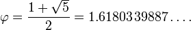
Knowing how to draw the human body is actually a lot more mathmatical than one might imagine. Above is Leonardo Da Vinci's "Vitruvian Man"; a drawing that investiages human proportions in comparison to the GOLDEN RATIO.
In mathematics and the arts, two quantities are in the golden ratio if the ratio of the sum of the quantities to the larger quantity is equal to the ratio of the larger quantity to the smaller one. The golden ratio is an irrational mathematical constant, approximately 1.61803398874989.[1] Other names frequently used for the golden ratio are the golden section (Latin: sectio aurea) and golden mean.[2][3][4] Other terms encountered include extreme and mean ratio,[5] medial section, divine proportion, divine section (Latin: sectio divina), golden proportion, golden cut,[6] golden number, and mean of Phidias.[7][8][9] In this article the golden ratio is denoted by the Greek lowercase letter phi ( ), while its reciprocal,
  or
or  , is denoted by the uppercase variant Phi (
 ).
).
The figure on the right illustrates the geometric relationship that defines this constant. Expressed algebraically:

This equation has one positive solution in the set of algebraic irrational numbers:
At least since the Renaissance, many artists and architects have proportioned their works to approximate the golden ratio—especially in the form of the golden rectangle, in which the ratio of the longer side to the shorter is the golden ratio—believing this proportion to be aesthetically pleasing (see Applications and observations below). Mathematicians have studied the golden ratio because of its unique and interesting properties. The golden ratio is also used in the analysis of financial markets, in strategies such as Fibonacci retracement.
NOW - Leonardo has settled on certain ideas of proportion that appealed to him as a man living in fifteenth century Italy. As we will see from the school hand-out, in cartooning, you have complete control of what the human body looks like and you can create your own proportions.
Mini lesson using "How to draw the Marvel Way" to investigate drawing the human body.
Lesson two:
Using your new found information on "FIGURE DRAWING" - draw a human body that is expressing the emotion on your flashcard.
Lesson three:
when everyone is done, students will go to the front of the class and pose in emotions for the other students to draw.
On flashcards there will be 20 emotions written on paper.
Wednesday, September 14, 2011

 ASSIGNMENT
PLEASE DRAW 10 EXPRESSIVE ANATOMY FACES DEPICTING EMOTIONS OF WORDS YOU DO NOT UNDERSTAND.
Today in class, attempt to communicate the face for the expression. These two handouts will help you get ideas. You can also work in pairs of 2 -3 where someone acts out the expression while the other two students attempt to depict the emotion.
If you don't know what a word means, consult a dictionary.
At the end of class, students may free draw, but their free draw must illustrate a specific emotion.
You will be sharing a sketchbook with a student in the B class! Flip your sketchbook over to see their work at the end of the sketchbook! Observing the work of your peers will help you grow as an anime artist.
ARTIST TO LOOK AT

Bill Watterson's Calvin and Hobbes Collection is a brilliant comic series that focuses on drawing in an iconic style, but with lush impressionist inspired watercolors and india ink drawings. Watterson never draws more than is necessary, occasionally completely ignoring environment.

Bill Watterson only draws what is necessary to tell a story. Notice how the environment is only depicted in the first panel. Watterson draws minimistically and iconically; this is because he is what is called a "cartoonist", a drawers of "whimsical pictures" in Japanese (Manga).
Observe the Calvin and Hobbes books and see how Calvin's emotions change and what is being "Said". After you are done drawing 20 new expressions, attempt to use 3 expression to tell a 3 part story.
You don not have to draw "well" to do a great job on this assignment. I am not looking for a depiction of reality. I am looking for you to communicate a three part little story using 3 expressions in each box.
The expressions CANNOT be:
happy
sad
angry
Use a new word learned from the faces or from looking at manga, Calvin and Hobbes, etc.
Tuesday, September 13, 2011
Wednesday, Sept. 13


Last week, we left off talking about expressions.
We attempted to develop iconic expressions from words in a thesaurus that had similar meanings to the words -
- happy
- sad
- angry
We then described the words and how they were seperate from the orginial word. For example: "What is the difference between the word PROVOKED and ANGRY?
We determined that when you are provoked there is a sense of REACTION and SURPRISE.
Being "PROVOKED" = ANGRY + REACTION + SURPRISE

We then drew all 4 of these iconic expressions.
When then free drew expressions for 15 minutes.
MINI LESSON ON HIEROGLYPHICS.
PLEASE DO NOT TALK OUT OF TURN. DEMERITS WILL BE HANDED OUT.
Subscribe to:
Comments (Atom)